Showing posts with label Tech. Show all posts

Monday, August 3, 2015

5 Things You Should Stop Doing Right Away To Retain Your Mobile App Users

Okay, let’s get to the point:
  • Your app is getting million downloads per month, but only few users stick with it thereafter
  • Your DAUs (Daily Active Users) are not happy with the overall app experience and are giving you bad ratings on app stores
  • Your mobile app users are not satisfied with your customer support & service

Sounds familiar? Yeah, we too have heard thousands of these stories.

There’s no denying that every company and app developer try and do their best to make their app a success when it’s launched in stores. Those with big budgets would do marketing magic shows, advertise on all possible and appropriate channels to increase visibility and create a buzz. Whereas, indie and small developers mostly rely on organic discovery and downloads to start with. Nonetheless, this doesn’t necessarily mean that they won’t lose on their user base.

A recent study shows that apps on an average lose around 80% of their users over the course of 90 days since App Install and there are million apps launched every month – around 1.6 MN android and 1.5 MN iOS apps were launched in July only this year. It’s quite evident that at the end of the day, there are very few apps which finally make the cut and are able to engage and retain their users in addition to acquiring new ones and having millions of downloads every month.

Whether you’re a small developer or an established startup, if you’re losing a major chunk of your user base, it’s because you probably are not paying attention to small & simple, yet the most important things. You know what you should do but perhaps ignore what you shouldn’t.

Acquiring new users is easy – retaining existing ones is hard, but not impossible. Here are 5 things you should stop doing right away that’s costing you your valuable user base: 
  1. Make an app with bad user experience: This has to be on the top of the list. An application with bad user experience is a nightmare. We humans crave for something that’s beautiful to look at, intuitive in nature, quick to grasp and easy to use. Your users go through a horrible experience with your app, they are never going to forget it and probably never use your app again. In contrast, give your users a 10/10 holistic experience and they will be your marketing megaphone. Research indicates that mobile app users are going to reach 4.4 billion mark by the end of 2017, which holds a lot of potential if you get your app’s user experience right.
  2. Create an app that takes light years to load and have loads of issues: Performance matters. People don’t install and check apps to learn to be patient. Users need fast responses and they need it now – that too without any technical glitches. If your app has sluggish performance, make tweaks right away or say Sayonara to your new hard-earned users. A study by MarketWatch last year found the same - users don't have much patience for poor-performing apps. 86 percent deleted or uninstalled at least one mobile app because of problems with its performance.

    Same research shows that from the US adults surveyed, 38 percent try another app when faced with a problem, 34 percent stop using the app, and 19 percent complain to friends and family. Now, don’t complain, you’ve been warned.
  3. Send push notifications, in-app messages and pop-ups every few hours: One of the most common mistakes that can force users to abandon your app even if you give them a superior user experience is sending endless push notifications, in-app messages and pop-ups. Though opt-in rates vary from industry to industry, games, especially strategy and role-playing ones have more success in engaging users because of their addictive nature. But even so, multiple pop-ups or too much notifications eventually irritate users who then start losing interest in your app and ignore any notifications you send in future – however relevant or beneficial those notifications might be to them.

    Worst case would be getting popups when they least want or expect it. Quick example: user has two applications to do online recharge, Application A and B. User opens Application A and fills required information but realizes that he has entered wrong details while checking out. To correct it, hits the back button in a hurry. A pop-up comes up, “Do you like our app? How about giving it a 5 Star Rating?” NO!

    Action taken – UNINSTALL Application A. Switch to Application B. Period.
  4. Send push notifications and in-app messages all at the same time without user permission: Know the difference between them and their purpose and use accordingly. Push notifications are for luring users to engage with the application and drive some action. Whereas, in-app messages are best when user is inside the app and actively interacting with it. Plus, users want to be in control. They would like to choose how and when they get notified. You should not just send notifications without hinting or setting context. Instead, it’s a good practice to educate or show your users. Otherwise, users are bound to opt-out of push notifications.
  5. Ignore what your users are saying: Don’t give a shit about what your users say? Stop doing it. NOW! Listening to your users’ feedback is as vital as creating an awesome user experience. In fact, working on feedback is the only way you can enhance user experience. Without your users’ voice, you wouldn’t exactly know what they want from your app, what’s bothering them or if they need any support.

    Denys Zhadanov, Director of Marketing at Readdle, knows how important it is to listen to customer feedback. “We respond to every support email, talk to them on social media in a very friendly way, release updates often and listen to their feedback,” says Zhadanov. Readdle is a Ukraine based startup which makes productivity apps and has 40 million downloads and five million monthly active users (MAUs).

    At the same time, you also don’t have to be very nosy and bombard user’s attention with feedback questions and surveys. Use intelligent engagement platforms to communicate with your users without being intrusive.

That’s it folks. To wrap up things up, just try not to:
  • Get labeled as someone developing apps with bad user experience and terrible performance. People have good memory when it comes to remembering their experiences with others – be it good or bad.
  •  Fire notifications like an Uzi. Rather use it like a Sniper Rifle, one bullet at the right time with max impact.
  • Ignore what your users say. Instead, take their feedback seriously, for it could be Holy Grail for your app’s overnight success.

Hope you don’t miss out on these 5 powerful app-saver checkpoints and your users are to stay with you. :)

Monday, March 24, 2014

Let Me Know Android App Re-Design

I worked at Let Me Know in the rainy season of 2011 as a blogger. For those who don't know, Let Me Know is a unique portal that helps students across India find opportunities of various kinds. And it was fun. I learned a lot of things from a group of enthusiastic people who believe in “breaking the Information barrier”.

A year later I saw they launched their Android application for on-the-go users to search for opportunities from anywhere. It had a very basic interface - quite like when android first rolled out.

But, in today's modern world, where simplicity and minimalism is the new trend and applications are developed on contexual information delivery grounds, I thought the app needed a re-design.

So, here it is: The New Let Me Know Android App. Take a look and "let me know" your views and feedback. :)

Disclaimer: This design is just a concept. Images copyright with Shaleen Sinha.


Old LMK Android App Splash Screen

New LMK Android App Splash Screen

Old LMK Android App Home Screen

New LMK Android App Home Screen with color-coded cards

Homepage Side Drawer for more options - Stacked Sideways

Homepage Side Drawer for more options (variant 2) - Stacked on Top

Old LMK Android App Event Listing Page

New Event Listing page with upper navigation bar color-coded according to the category selected
with better & equal spacing within and around the cards, and relevant icons to quickly grasp
critical information. This is a screenshot of the 'Technology' events listing.

Similarly, upper navigation bar is color-coded with green for 'Social Sciences' events listing, (if someone opens
'Maths & Science' opportunity category listing, then the upper navigation bar will be black in color and so on..).

While listing all the opportunities, the cards are color-coded  sideways with vertical line stripes according to
the category they belong to, so that the user knows which opportunity is from which category.

Old Event Details Page

Event Details Page of the New LMK Android App. Here also, information is divided by
equally spaced lines and whitespaces and with relevant icons for quick information grasping.

In addition to all that, contextual options are included for taking quick actions without leaving the page.
Like an 'Add to Calendar ' button is included right beside the 'Timeline' information for adding the event to
your calendar application. A 'Notify Me' button will automatically remind you of the deadline a day before
via email, phone or the alarm clock application.

All these contexual buttons are included with the aim to make user experience convenient and easy,
and to integrate information right into the device's native applications like Calendar, Clock, Email etc.
'Apply Now!' had to wear a big and bold look for better visibility for the user to take quick action
and apply at the moment, right from the app without going anywhere else.

This is a variant to the Event Details Page. Contextual buttons have been shifted upwards and are merged with
the navigation bar. 'Share' button is an add-on. You can now share opportunities with your friends
via email, social networking sites, whatsapp, and lots more.

This is an another variant of the Event Details Page. Contextual buttons are completely placed within a
color-coded bar at the bottom. The color of this bar changes according to the opportunity category selected.
For example, Blue for 'Technology', Green for 'Social Sciences', Black for 'Maths & Science', and so on..

New LMK Android App Search Interface. As you search for keywords, the app will suggest
opportunities with its respective color-coded category symbol on the left so that the user
knows which opportunity belongs to which category as he searches.


© Copyright 2014 Shaleen Sinha. All rights reserved.
Images may not be copied, printed, or otherwise disseminated without express written permission.

Saturday, November 9, 2013

Multi-tasking is a lie

Multi-tasking is a lie. At least in case of humans, it is. We have been fooled into believing that we can multitask and we should be doing so. Big advertisements and banners advocate this aloud. 1.5 Ghz Dual core, 4GB RAM, blah, blah and blah.

The false promise

Companies invest heavily in the idea of multi-tasking so that they could sell whatever they want and customers fall into vicious cycle of the need to buy more luxurious cars, secure devices, faster smartphones and what not – even if they don’t need it!

But who really even cares! They sell so that they could benefit and we buy because we can afford. That’s it. Instead of worrying about if we would really use the product, we measure whether buying that is within our financial reach or not. Usability of products has been replaced by affordability and one’s social status. And buying habits are now driven by the parameters to fit into the society.

Well, that’s how business and marketing is done in this world. And we will continue to consume in the same way until we pause and reflect.

Back to multi-tasking

If you are wondering how multi-tasking an illusion in case of humans is, you have to understand what multi-tasking really is and how it differs.

Simply put, it is the ability to execute more than one task at the same time. A/c to Wikipedia, “In computing, multitasking is a method where multiple tasks (known as processes) are performed during the same period of time, i.e. simultaneously.”

The system quickly switches between each computing task to give the impression the different applications are executing multiple actions simultaneously. [source]

The computer can have multiple CPU or cores to handle a number of tasks at a time. Therefore, computers have multi processors capable of doing many jobs at one time. But, note that even the computer processes one thing at a time by switching over from one task to another over a period of time to complete the requests made by the users.

Multitasking does scheduling of tasks as to which task will be the one running at any given time, and when another waiting task gets a turn and this is achieved by using a concept of threading.

Say you are working in MS Word, doing web browsing and listening to music, all that at the same time while eating mouth-watering Chocolate Cupcake. The CPU handles these processes in time slots with each application accessing a separate processor core simultaneously.

So, if two tasks are handled at the same moment, then it is by two different cores or processors. In case of single core/processor only one task runs at any point in time and the CPU is actively executing instructions for that task, having done the scheduling of a number of tasks to be performed after another. So in one second it is executing an MS Word instruction and in the next, it executes the processes to handle web browser instructions. Therefore, in real sense we are actually doing only one task at a time (handled by multi-processors).

Multi-tasking in humans

However, multi-tasking in humans is different from that of computers. Instead of an impression of doing multiple jobs at the same time, we, humans can only fast switch between jobs with our attention. We don’t have multi processors to handle a number of processes having access to each different processor to execute different processes.

Let me clear this with an example. Suppose you are reading something, listening to music, and checking your facebook notification on your phone all at the same time. Another common example that we all usually do can be taking phone calls while typing an email (or doing something else) or driving and listening to music or washing dishes and talking.

We think we are multi-tasking. But, if we really think over it for a second we are not actually multitasking. We are only doing one task at a moment (uni-tasking). To clear this out, let’s take the above mentioned situation. When you are reading a book for, say, 1 minute, all your focus is on the text; not on anything else. And during that time music also kept playing in your earphones but your focus was only on the text of the book, not on the music. When you listened to music, you aren’t reading (focusing) on the text anymore. That’s switching happening there, not processing (doing) two tasks at the same time. It’s a very minute and subtle process that we barely notice. Happens in microseconds.

And didn’t you ever notice when you were talking on the phone while doing something else at the same time that you only listened to what the other person was saying in chunks – not the whole conversation? That’s because your mind was processing something else at moments. Your attention was sought by that other thing you were doing. And whenever you switched your attention back to the voice on the phone line you processed what the other person was saying.

Conclusion

Needless to say, our mind can only do (process) one thing at a time. Think of it as working in time slots. In human context, there is no such thing as multitasking at a given moment - it can only be realized for a span of time. So, you might say we multi-tasked for a period of time but in real sense we focused only on one thing given at one time.

At last, multitasking in humans can result in time wasted due to human context switching causing more errors due to insufficient attention. So…

Apparently, we are practicing distraction in multitasking. We switch back and forth between things with our attention. And the more we multi task the less efficient we will be.

Friday, September 6, 2013

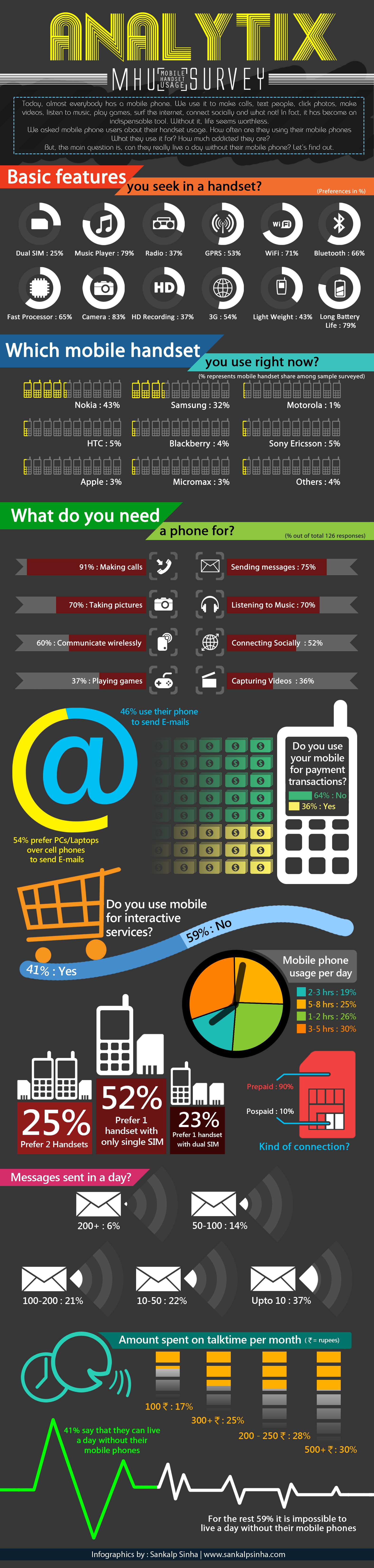
Analytix Mobile Handset Usage (MHU) Survey 2012-2013

Today, almost everybody has a mobile phone. We use it to make calls, text people, click photos, make videos, listen to music, play games, surf the internet, connect socially and what not! In fact, it has become an indispensable tool. Without it, life seems worthless.

So, we asked mobile phone users about their handset usage. Our motive was to study the usage of mobile phones among the users, analyzing and providing mobile phone usage behavior data. How often are they using their mobile phones? What they use it for? How much addicted they are?

But, the main question is, can they really live a day without their mobile phone? Let’s find out.

Here is an awesome infographics of the survey designed by Sankalp Sinha:

main
You can also download the whole report of the survey (pdf version) which contains detailed information of the sample size,  methodologies used, mobile handset market scenario, other key outcomes and consequences of using mobile phones. And at last, an appeal from Kartavya, a Non-Governmental Organisation which is helping many underprivileged children living in slums and villages realize their dream by providing free and high quality education near college campuses.


Download the whole Analytix Mobile Handset Usage (MHU) 2012-2013 report (pdf version).


Saturday, March 30, 2013

Minimal Lite

Today I am re-launching my personal website after a re-design. Here's why I am doing it.


My aim was to design a site minimal in approach with the least possible distraction, noise and clutter. Prime purpose was to let readers focus more on content instead of being distracted by multi-block layout, cluttered design, advertisements, buttons that beg to click, lots and lots of unnecessary links, too many widgets and more... Creating a memorable experience for the reader.

Result: A simple, pure and clean minimalist website!

In order to achieve that, the site had to have:
  • A good-sized readable font
  • Column width optimal for reading
  • Pure white background for clear content visibility
  • Light color schemes
  • Minimal navigation with less clutter


What it has and what not?

Minimal Lite is characterized by:
  • A header
  • Single coloumn body layout
  • And a footer
  • Nothing else!

It does not have:
  • Navbar
  • Sidebars
  • Multi-layout footer
  • Unnecessary widgets and links


Brief description about the design

Green is the color of nature, balance, growth, hope, learning, harmony and life. It also happens to be one of my favorite colors. So, I chose it. Color hex code is: '#88c34b' and corresponding RGB code is Red: 136, Green: 195 and Blue: 75. You can convert hex color code into RGB and vice versa here. Font used universally is 'Segoe UI' and body font-size is 14 pixels. Content width is 780 pixels wide and I think this is the perfect dimension for the design.


More details about the template


Header

1. Get rid of the annoying Navbar:

Install the template.
Edit in Blogger template editor.
Find 'navbar'.
Delete the widget.


2. Horizontal Green Line at top:

Add this code just after the closing head tag </head>:

<div style='top:0px; width:100%; position:fixed; height:10px; background-color:#92D050; z-index:100;'>
</div>

If you don't want this horizontal line to be fixed, delete 'position:fixed' name value from the code.
You can also change the color, height and other variables as desired or even remove the whole code if you don't want it.


3. Header Image:

700px wide by 233px in height.
Color used is '#88c34b'.
Font used for the text in the image is: 'Rockwell', Bold.
Description font is: 'Adobe Arabic', Italic.


4. Blog Title:

Search for group description 'Blog Title' under variable definitions of <b:skin>.
Title color is #88c34b.
You can change other values as well:


Body

1. Content Width:

It is 780 pixels wide. I think this is the perfect dimension.
But, in case you are not satisfied, look for 'content.width' in the template editor.
Change the value here:

<b:variable default='960px' name='content.width' type='length' value='780px'/>


2. Links Gadget:

On the top you will find the links gadget which can be added and edited from the layout section of your blog settings.
Letter-spacing is 4px for clarity.
Font-size is 17px for better visibility.
And individual font-color is #71625A to match the design and color scheme of the site.
Added as HTML/javascript gadget below the header.
You can edit as per your requirement:


3. Post Title:

Change this under body css after variable defnitions of <b:skin>.
Find 'post.title' variable name under group description 'Post Title':
Color is the same as that of the blog title; #88c34b.
Font size is 26px.

Note: I have also changed the post title footer. Search for 'post.title' where css is written. You will find these definitions:

margin-top:21px;
margin-bottom:22px;

Alter the values as desired.


4. Body Text Font & Color:

Find the variable name 'body.font' under group description 'Page Text' at the begining of the variable definitions of <b:skin>.
Default font size is 14 px.
Font family is Seoge UI.
You will find all the values you need to change, if you wish:


5. Page Title:

The page title appears in the body/content of every page and sometimes gets repeated.
To stop displaying the page title in the content section/body, first search for ']]></b:skin>'.
Add this code just after it:

<b:if cond='data:blog.pageType == &quot;static_page&quot;'>
<style>
.post-title.entry-title{
display: none;
}
</style>
</b:if>


6. Links:

Default link colors have been defined under 'Links' group description.
Search for 'link.color' followed by other link variable names:
Link hover color has been assigned the theme color of the site: #88c34b so that if hovered over a link the link color changes into green.


6. Other variable definitions:

Similarly, you will find other variable names like body.background.color, description.text.color, date.header, post.footer, image.background.color, widget.title, etc. which you can edit as per your preferences.


7. Remove Border And Shadow From All Images

Search below similar code in your template:

.post-body img, .post-body .tr-caption-container, .Profile img, .Image img,
.BlogList .item-thumbnail img 
{
 padding: $(image.border.small.size);
 background: $(image.background.color);
 border: 1px solid $(image.border.color);
 -moz-box-shadow: 1px 1px 5px rgba(0, 0, 0, .1);
 -webkit-box-shadow: 1px 1px 5px rgba(0, 0, 0, .1);
 box-shadow: 1px 1px 5px rgba(0, 0, 0, .1);
}


Replace the entire piece of code with the code given below:

.post-body img, .post-body .tr-caption-container, .Profile img, .Image img,
.BlogList .item-thumbnail img {
  padding: none;
  border: none;
  background: none;
  -moz-box-shadow: 0px 0px 0px transparent;
  -webkit-box-shadow: 0px 0px 0px transparent;
  box-shadow: 0px 0px 0px transparent;
}


Footer

1. Post Subcription Links:

Delete unnecessary footer post subcription links.
This will remove 'Subscribe to: Posts Comments (Atom)' from the posts' footer.
Find 'post.feeds' in the template editor.
Delete this whole section below:

<!--Post feed links -->
    <div class='post-feeds'>
      <b:loop values='data:posts' var='post'>
        <b:if cond='data:post.allowComments'>
          <b:if cond='data:post.feedLinks'>
            <b:include data='post.feedLinks' name='feedLinksBody'/>
          </b:if>
        </b:if>
      </b:loop>
    </div>

And boom! They are gone forever.


2. Body Feed Links:

This will delete 'Subscribe to: Posts (Atom)' from the body footer.
Find 'feed-links'.
Delete this whole section:

<div class='feed-links'>
  <data:feedLinksMsg/>
  <b:loop values='data:links' var='f'>
     <a class='feed-link' expr:href='data:f.url' expr:type='data:f.mimeType' target='_blank'><data:f.name/> (<data:f.feedType/>)</a>
  </b:loop>
  </div>

DONOT delete the line above this section i.e.: <b:includable id='feedLinksBody' var='links'>


3. Attribution:

Be free of the default traditional attribution and add your own custom attribution.
Search for 'attribution' until you get this code below.
Delete the attribution widget.
And add this code below as a HTML/javascript gadget at the bottom from the layout settings of your blog:

<div id='footer' align='center'>&#169; 2013 <a href='http://www.yourdomain.com/'>Your Site Name</a>
<br/>
<a href='http://www.shaleensinha.com/'>Minimal Lite</a> designed by Shaleen Sinha
</div>

Make appropriate changes like your domain url, name and text accordingly.


4. Comment Box Width:

Within “Blog1” widget, expand ‘comment-form’ and ‘threaded-form’ includable.
Find ‘comment-editor’
Go for the “width='100%'”
Then find this code:

<iframe allowtransparency='true' class='blogger-iframe-colorize blogger-comment-from-post' frameborder='0' height='410' id='comment-editor' name='comment-editor' src='' style='display: none' width='100%'/>
    <b:else/>

Change the value of width from % to your desired length in pixels.
I have kept it 690px.

Note: You need to follow the above instruction four times (4) wherever you find height='410' because the comment box appears in various div sections.


Extras

Archives Page

1. Search Function:

Centrally aligned.
Searches your site for keywords entered through Google.
Look for 'var domainroot'.
Type in your domain name:

<script type="text/javascript">
   var domainroot="yourdomain.com"
   function Gsitesearch(curobj){
    curobj.q.value="site:"+domainroot+" "+curobj.qfront.value
    }
  </script>
<div style="font-size: 16px; letter-spacing: 4px; text-align: center;">
<form action="http://www.google.com/search" method="get" onsubmit="Gsitesearch(this)">
<div class="search">
Search this site:<br />
<input class="texta" name="q" type="hidden" />
<input name="qfront" style="height: 14px; text-size: 12px; width: 180px;" type="text" />
</div>
</form>
</div>

You can also change the dimension and look of the search box or text by tweaking with the style attribute.

2. Others:

Search by labels are added manually and so are the links to the posts, using <ul> lists.
Change the links in the subscription section to have your RSS and email subscription links.


Connect Page

1. Email Subscription Box:

It is centrally aligned.
Form box is 300px wide.
Input box is 170px in length:

<div align="center">
<span style="font-size: 20px;">Subscribe via Email</span>
<br />
<form action="http://feedburner.google.com/fb/a/mailverify" method="post" onsubmit="window.open('http://feedburner.google.com/fb/a/mailverify?uri=YOURFEED', 'popupwindow', 'scrollbars=yes,width=560,height=550');return true" style="border: 1px solid #ccc; margin-top: 5px; padding: 4px; text-align: center; width: 300px;" target="popupwindow">
Enter your email address:<br />
<input name="email" style="width: 170px;" type="text" /><br />
<input name="uri" type="hidden" value="ThoughtsInThree" /><input name="loc" type="hidden" value="en_US" /><input type="submit" value="Subscribe" /><br />
Delivered by <a href="http://feedburner.google.com/" target="_blank">FeedBurner</a>
</form>
</div>

You can individually change the attribute values for fonts and form dimensions.

2. Others:

No image has been used for how-to-connect options like rss, email or facebook.
The link-texts are manually coded using css for their individual colors.
Here's a great site for color selection from any picture or logo: ImageColorPicker


Download

You can download this template. It is for free! Yes! You can download, install and tweak it for your own website without asking for permission:


Note: Do backup your previous template before installing. Proceed at your own risk. I am not responsible if you don't find your dashboard next time in case anything goes wrong. Still, if you have problems/questions regarding this template and need support, then email me.


Enjoy!


Friday, August 31, 2012

Songr | Review

Now-a-days music lovers have a bunch of options to download music tracks/albums via p2p sites, sharing sites, hosting sites and a lot more. For a newbie, it would be hard to search over and find such direct-linking sites. Even though, if someone has a list and access to a number of such hosting and sharing sites, they would have to go through a longgg time-consuming hectic process which may include clicking through endless URLs, skipping ads, passing CAPTCHAs and other unnecessary steps in order to get their download started. Shouldn’t be there one stop portal for searching, streaming and downloading music tracks/albums at once, for all?

Well, there is a solution: Songr! - Freeware desktop client used to search, stream and download music. Songr does not index nor host any mp3 files; it only searches the string entered in various search engines and returns results. Created by Andrea Martinelli, it is available in more than 27 languages, Songr works on Microsoft Windows, Linux and Mac.

"Searching and downloading your favorite tracks was never this easy!"

With its simple, minimalistic interface and an integrated search box, you can search for your favorite tracks from 16 different third party mp3 search engines. Search for single tracks, artists, full albums (in ZIP/RAR formats) or even get the best result automatically and it’s easy to filter your results according to needs using Intelligent Sorting (displays high quality mp3s on the top of the list).

Songr 2 Preview

Artist Search: Playing Summmer of '69 by Bryan Adams in Songr 2. Songr loads the artist information instantly.

Songr 1.9 Stable Artist Search Interface

Songr 1.9 Track Search: Searching for One Republic's Good Life. You can either Play, Preview or Download tracks

Songr 1.9 Album Search: Searched for Linkin Park's Living Things album. Here's a list of download links and track listing

Searching through "Artist" displays information from Wikipedia about the artist searched along with a media player of the artist's songs. Plus, it also searches songs by their lyrics (powered by Bing). So, don’t get amazed while discovering music by typing some words in the Search by Lyrics panel and get an audio preview (powered by Amazon) instantly. You can also play music stored in your local hard drive! And, when you do that, Songr automatically loads the artist information and the lyrics – just like that.

Songr 1.9 Search by Lyrics: Searched for Adele - Rolling in the Deep through lyrics

Lyrics shown while playing music in Songr 2

One can also switch to Songr 2 Preview, which was launched on 31st October 2012. It has a new clean interface (still simple and minimal in nature) and fluid navigation for discovering new music and updates separately from the current stable version.

And just think how cool it would be if you could not only download YouTube videos but also extract audio files? Yes! Songr lets you do that. You can download HD YouTube Videos and can even extract/convert mp3 out of them. It also includes automatic conversion of results to direct links to listen straightaway in Windows Media Player. Though downloads cannot be paused, users can preview songs before downloading.

Download YouTube videos directly or extract mp3 file

In addition to all this, Songr gives you an option to buy music from popular online stores like Amazon, eMusic, Rhapsody and Zune.

Songr is more useful to non-torrent users who don’t have access to p2p sites/applications or to those who waste thousands of minutes searching for tracks all over the net. Hence, at the end of the day, the only thing that comes to mind for Songr is: Get hassle free music directly to hard drive without any mindboggling ads or restrictions!

You can download Songr from here.

Thursday, May 31, 2012

Ready for the next gen iPad? | Review

In just a less than a year with almost 15 million devices sold, Apple unveiled the second-gen of the iPad phenomenon. And this time the design is outstandingly brilliant and the aesthetics gets an improvement. iPad 2 seriously raised the bar through its sleek, sexy, lighter, nimble and mobile hardware.
The Next-Gen iPad 2
The first thing you'll definitely notice about the iPad 2 is that it's unbelievably thin (33% thicker). At its thickest point, the tablet is just 0.34-inch. The plastic plate makes it 15% lighter than it’s been ever before even if the back is carved of metal, demanding a protective case (Smart Cover). The device is slightly shorter than the previous model (at 9.5-inches tall), but also slightly less wide (just 7.3-inches versus the iPad's 7.47-inches). It looks and feels amazingly sleek - quite a feat considering what's packed inside the slate.

Talking about the soul features, while the iOS 4.3 holds its position, Apple has replaced last year's A4 CPU with a new, 1GHz dual core chip called as the A5. Memory has been increased from 256 MB to 512 MB DDR2. The screen is identical to the previous model, a 1024 x 768, stronger 9.7-inch IPS display with LED backlighting and a fingerprint and scratch-resistant oleophobic coating. The iPad has a 25 watt-hour rechargeable lithium-polymer battery that lasts 10 hours, like the original iPad. The battery is 2.5 mm thick, 59% smaller than the original and has three cells instead of two. It is charged via USB or included 10-watt, 2-amp power adapter.

This time iPad's mono speaker got relocated to the back of the device. The sound is clear; thanks to its Dolby Digital 5.1 stereo surround sound. Other specifications include 5x digital zoom VGA Dual cameras for video chat, HD video recording and stills, Wi-Fi (802.11a/b/g/n), Bluetooth 2.1+EDR, 3G cellular HSDPA, 2G cellular EDGE, Geolocation, Assisted GPS, Apple databases, Improved AirPlay features and HDMI output (via optional adapter). And it should be noted that under the App Store over 65000 Apps are ready and waiting to get your hands on.

Apple offers both white and black versions of the iPad 2 in every price and configuration. The base model starts at Rs. 24,500 giving you 16GB of storage and a Wi-Fi. If you want more storage for all your applications, photos, music, and videos, you can jump up to the 32GB (Rs. 29,500) or 64GB (Rs. 34,500) models. 3G versions are also available in all the models for an extra Rs. 6000-7000.

Tuesday, April 17, 2012

New Launch: Motorola XOOM | Review

Given Moto's partnership with Google, the big launch of CES 2011 and the first Android 3.0 Honeycomb tablet on the market; Motorola XOOM has got to live up to anything and everything if it has to make the much assumed inevitability of Apple’s iPad a very serious false reality. And let me tell you that this new toy in the market possess the potential to give a tough head-to-head fight to other established brands.

It has got a 10.1-inch 1280×800 widescreen display and is 12.7 mm thick. Packed with 5 MP Camera for HD recording and 2 MP in front Dual LED Flash, it features Google’s Android 3.0 Honeycomb. Performance can be expected gentle for its 1 GB DDR2 SDRAM and 10 Hrs. of battery backup.

The device also merges 720p Playback, 3D graphics acceleration, HDMI, Bluetooth 2.1 + EDR, Wi-Fi a/b/g/n, GSM/EDGE Class 12, UMTS/HSDPA.

Tuesday, April 3, 2012

New Comer in the Galaxy Line: S2 | Review


This Korean firm may not be the Big Daddy in the list of smartphone manufacturers, but it now rises up with a new dynamism, making another step forward by putting all the best technology it can into a ridiculously thin mobile. Samsung’s flagship mobile handset line is the Galaxy S II, which is considered as a direct competitor of full-touch screen phones and environmentally friendly smartphones.

The Galaxy S2's main talking point is the 4.3” WVGA Super AMOLED+ screen covered with Gorilla glass, featuring a new color gamut, contrast ratio and apparent 80% reduced power over the previous versions.  The phone’s design is brilliant, for the Touch Screen comes with TouchWiz 4.0 UI and is just about 9mm thin.

It is inbuilt with 1.2 GHz Dual Core ARM SoC processor along with 1GB RAM for the first time. It runs on Google’s Android 2.3. The flash memory supports 16 and 32 GB space. The 1650mAh battery provides about 450 hours of standby and approximately 8 hours of talk time.

This device features an 8 MP camera with LED flash and AutoFocus, on the back, that can record videos in Full HD 1080p at 30 fps. There is also a front-facing 2-megapixel VGA camera for video calling. It supports almost every multimedia formats. It also has an HDMI, Bluetooth v3.0 + HS, USB 2.0, GPS System and Wi-fi a/b/g/n, 3G HSDPA and EDGE.

Thursday, March 1, 2012

Windows 8 Consumer Preview

Microsoft has released the Windows 8 Consumer Preview, allowing you to have a look at some of the new features before the final version of Windows 8 arrives later this year in October.

It is fast, secure, immersive, fluid, intuitive and interactive. With the all new Metro Style Apps, Microsoft has set the standards for the upcoming OS. I must say, with Windows 8, Microsoft has showed how an OS should be which focuses on people and apps giving you powerful new ways to use social technologies to connect with the people who are important to you.

It's Windows reimagined and reinvented! The Next Gen OS: Windows 8! :)


Here is a quick sneak peek:


Windows 8 Boot Screen

Hybrid Boot will use "advanced hibernation functionality" on shutdown to allow faster startup times.


Windows 8 Logon Screen.

You can sign in to your local account or using your Windows Live ID which allows the user's profile and setting to be synchronized over the internet and accessible from other computers running Windows 8, as well as integration with SkyDrive.

Apart from typing a password, a new authentication method allows users to use a set of gestures in the selected picture to login by clicking on the Logon Options.


Windows 8 Lock Screen.

Displaying App notifications at the bottom. Signing out and restarting will open from where you left off.


This is your new Start Menu: forget the old one. From now on this Metro Styled Start Screen with Live App Tiles will be all.


This is how you drag and rearrange the Live Tiles. They are called Live because they view live information from Windows 8 Metro Style Apps without actually accessing the apps.


By right clicking on the Start Menu, you can access each and every App available in your PC. You can pin them in the Start Menu as well.


It is called the Charms Bar.


It appears as you move your cursor to the bottom/up-right of the screen with a bunch of options. Charms can also be used to quickly configure settings for individual apps.

All sort of notifications can be accessed from here.


Charms Bar accessed by just moving cursor to the top right and when the cursor was moved a bit down, then the whole menu and a little notification status splashes.


This is kind of a control panel for Windows 8.


This is the new look of the Windows Explorer.

You can notice a few changes. First of all the Start Menu is gone. You can access it by tapping the Start Menu button or by moving your cursor to the bottom left of the screen where it was used to be.

Second thing, the Ribbon interface from the Microsoft Office Suite has been included to enhance discoverability of commands and bring relevant commands to users depending on their file selection.


The Ribbon interface was selected to bring forward the most commonly used commands for easy access. For example, selecting photos in a folder brings up tools to rotate the photos and to start a slide show.

Here, selecting a music file provokes a Play tab for further commands.


Windows Explorer features a new user interface for copying and moving files, offering both a simplified interface and an advanced interface for users to monitor the speed of the operations, viewing all simultaneous file operations in one consolidated window, and can pause file operations in progress.

A new interface has also been introduced for managing file name collisions in a file operation, allowing users to easily control which conflicting files are copied.

Windows Explorer can now also mount ISO, IMG, and VHD files as virtual drives through simple right-clicks or the Explorer toolbar without installing any external Apps.


When you open any type of file for the first time, it will ask you to choose the default program like this, even if you insert an USB.


Displaying notifications on the top right corner.


New Simple Task Manager.

You can see an expanded version by clicking on the More Details.


Expanded Version: The Processes tab now lists application names, application status, and overall usage data for CPU, memory, hard disk, and network resources for each process.

Resource utilization in the Processes tab is shown with various shades of yellow, with darker color representing heavier use.


The Performance tab is split into CPU, memory, disk, Ethernet, and wireless network (if applicable) sections. There are overall graphs for each, and clicking on one reaches details for that particular resource.


The New Taskbar can be seen by moving your cursor to the upper left of the screen. By just tapping there you can double switch between running Apps as you do by tapping Alt + Tab.


Windows 8 introduces the New Internet Explorer 10 with default full screen browsing.


Right clicking will provoke the tab bar. Add new tabs or switch between them. A simplified address bar is at the bottom.

Closing or restarting will open from where you left off.


Opening a new tab will display frequently visited web pages or pinned.


As I start typing any web address, it starts searching for it.


Windows 8 Metro Style Mail App.


Now, no need to open mail box in any browser. Your mail box right in your Start Menu.

Simple and Clean. Mail box to the left and Mail Previews to the right. And just the three buttons for every mail: New Message, Reply and Delete.

Again the same, closing or restarting the App will open from where you left off.


Adding Gmail Account to the Mail App.


By right clicking, you can access the folders.


Sending a message. Very simple and clean. Lot of options too.


Attaching a file in an email.


You want share? Share anything right from the Charms Bar. Here's is a picture I want to share.


You want share? Share anything right from the Charms Bar. Here's is a video I want to share.


You want share? Share anything right from the Charms Bar. Here's is an webpage I want to share.


This is the People's Hub/App, connected with all the social networking sites.


Like all in one place. Opening it will first display all your contacts from Google, Facebook, Twitter and LinkedIn accounts; provided you have your Live ID associated with them.


What's new displays the News Feed from all the social networks. Closing or restarting the App will open from where you left off.


A post has been clicked. On the right side you can like or comment right from here. No need to open the sites in a different browser.


Windows 8 Metro Style Music App. More like ZUNE.

Search music in your local hard disk or in the marketplace.


Whenever you search an artist, it will retrieve information online about the artist and show you a list of collection you have in your local disk and songs from the marketplace.


Searching for music files from the Charms Bar. You can also search in Apps.


It plays music in full screen mode with an album art as background. You can dock all Metro Apps. And closing or restarting will open from where you left off.


Windows 8 Metro Style Messenger App & Windows 8 Metro Style Finance App

Windows 8 Metro Style Apps can be docked and worked simultaneously.

On the left, Windows 8 Metro Style Messenger App is docked where I can chat with my online friends; think it of as a multi-messenger service. And on the right Windows 8 Metro Style Finance App is docked. It provides rich insights of the market with a lot of parameters.


Windows 8 Metro Style Photos App.

You can access photos stored in your local hard disk, SkyDrive or from Facebook. Interface is amazing.


Windows 8 Metro Style Video App

I am watching a video in this App and accessing options for the App from the Charms Bar.


Windows 8 Metro Style Reader App.

Windows's own Pdf Reader App. No need to install Adobe Reader now. I am opening a file.


A file opened in Windows 8 Metro Style Reader App. Right clicking will show a list of options. Great interface. Closing and restarting will open from where you left off.


Windows 8 Metro Style SkyDrive App.

Accessing files stored on the cloud via SkyDrive App right from my Start Menu. No browser required.


Windows 8 Metro Style App Store.

Search, Buy, Try and Install Apps. Hundreds of them and more to be added.


Windows 8 Metro Style Apps


When you open any App, the interface is very much interactive and immersive. App name will be displayed at the top or center and loading UI will be right below it with dots cycling around.


Widows 8 Metro Style Yahoo Cricket App.

Upper image showing matches currently played on and the lower one showing scoreboard for a particular match.


Windows 8 Metro Style Dailymotion App


Windows 8 Metro Style NDTV App